18.2

18.4


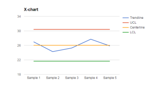
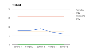
The x-chart shows more variation from the center line, this shows that the ranges of the data is not widely dispersed. Both charts show the data keeps within control limits.
18.6

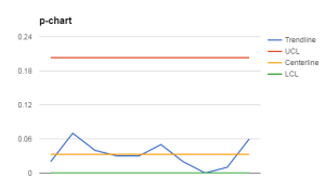
The data touches the LCL which is not a big deal and the data stays well below the UCL.